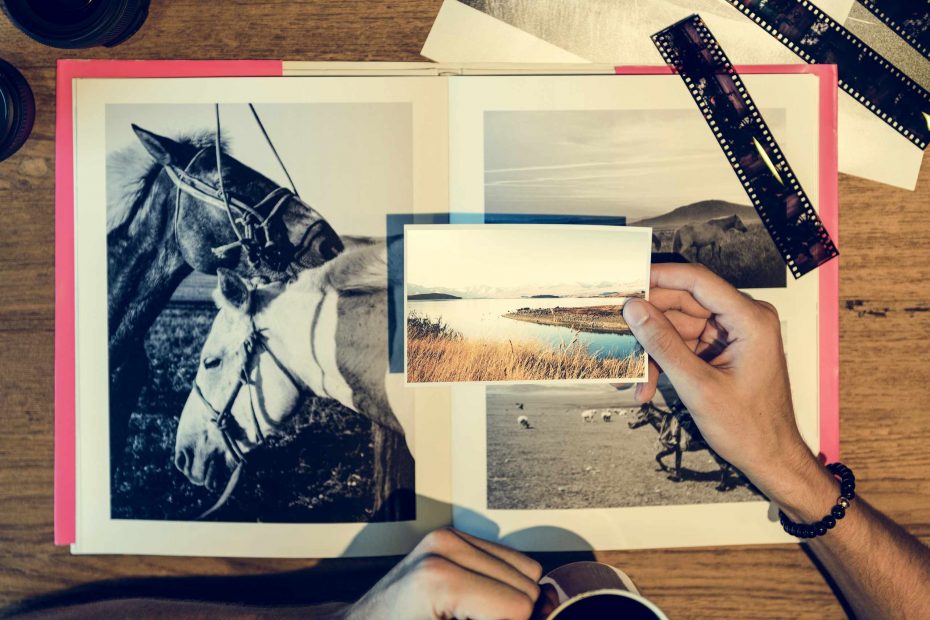
Most first books suffer from the opposite problem. You start with too many photos. A simple photo folder might contain a dozen or more versions of the same picture. It includes different shots of the same person, different angles of the same table, or various images of the same landscape just a few seconds apart. It’s easy to leave all of these in the album because the idea of throwing any away feels too difficult. But the result is an album that’s more challenging to read. That first photo book isn’t about proving that everything happened. Rather, it’s about sequencing those images into pages that let you feel the story’s best moments.
Before you begin building with a photo book template, consider what that book is trying to say to its reader in a single sentence. Is it a book about a family weekend? Is it a travel album? A birthday celebration book? A year-in-review book? Whatever your purpose may be, write it out. It might be “a quiet weekend by the lake” or “our first road trip through the old city.” This statement serves as a guide or theme for you to consider. Not every good photo needs to be included. In your photo editor, you might move it to a file on “maybe” rather than forcing it into a spread.
An easy way to begin your sorting process is to create three groups in your photo editor: “Keep,” “Maybe,” and “Remove.” The images you keep are those that help tell the story, have a clear subject in them, or provide a specific element that makes the photo page more interesting. The “maybe” group includes images that aren’t terrible photos but haven’t yet found their place. These are waiting for you. Images in the “Remove” folder might be duplicates, blurry, closed eyes, awkward cropping, or simply too similar to images that you have already selected. You won’t have to sort these images perfectly in this first group. The important step is to get them out of the way enough so you can see what the photo book will look like.
Similar photos need special attention since they are so easy to overuse. If you have five photos of the same person in the same place, ask which photo has the easiest job to do on the page. One photo might serve as the large feature photo because of the clarity and detail of the subject. A different image might work as a detail shot that shows a sign, a gesture, or a reaction. You would probably put the remaining images in the “Remove” folder, even if they are beautiful images.
Once you’ve completed a first group sort, you might also consider testing a sample photo sequence with about a dozen photos. Arrange the photos in sequence and decide which photos will work well before considering background, frame, or caption style. Look for a variety of photo types. There should be one wide shot to give the reader a sense of place, two or three photos with people that serve as feature photos, one or two detail photos, and a photo that brings a sense of closure to the sequence. If that test sequence feels redundant, there’s a pretty high chance that your whole book will feel cluttered. That’s okay! Use the test sequence as an indicator as to whether your photos are beginning to have a sense of flow and rhythm before you move onto more technical aspects of page design such as margins and safe zones.
Photos also may need caption help. If two photos require a caption of nearly the same length, then you probably don’t need them both. If a photo requires a lot of captioning before it is understood, then it might not be appropriate for this first photo book if the image itself doesn’t hold the most important memories in this theme. It works best to choose photos where the photo is mostly carrying the caption with the caption only offering a supporting role, such as a date, time, place, or other short comment. The layout grids will also help the captions feel appropriate to the page.
A strong first photo book might be a result of choosing fewer photos rather than more. Once you’ve chosen the final collection of photos, take one final look. Does the page spread have a clear center? Are the margins and page flow enough so that the reader’s eye can easily move to the next page? Does this book feel less crowded? Less forced? And finally, is the cover photo a good enough image to summarize all of the photos within the book?